
The final steps of an online purchase should be the smoothest part of the customer journey, yet for many businesses, this is where the most significant drop-offs occur. In the world of e-commerce, every extra second of loading time or every unnecessary form field acts as a “tax” on your conversion rate.
When we talk about checkout UX friction in Magento, we are looking at the technical and psychological hurdles that prevent a visitor from completing their order. While Magento is a powerhouse of flexibility, its default settings often prioritize database logic over human intuition, leading to abandonment. By identifying and removing these blockers, store owners can turn a leaky funnel into a streamlined path to revenue.
What causes checkout UX friction in Magento
To solve a problem, one must first define it clearly. Checkout UX friction in the Magento context refers to any element of the interface or technical performance that causes hesitation, confusion, or physical difficulty for the user. It is the digital equivalent of a long queue at a physical supermarket where the cashier asks for too much personal information before ringing up the items.
Magento’s default checkout structure, while functional, is often criticized for being overly rigid. It was designed to handle complex B2B and B2C logic out of the box, which means it includes many fields and steps that a standard retail shopper might find exhausting. When a platform tries to be everything to everyone, the user experience usually suffers from bloat.
The connection between friction, abandonment rate, and revenue loss is direct and measurable. Industry benchmarks consistently show that over 70% of shopping carts are abandoned before the purchase is finalized. In Magento stores, a significant portion of this abandonment is attributed to friction points like forced registration or slow page response. Every point of friction increases the cognitive load on the shopper.
Common friction points inside the Magento checkout
Too many required fields and unclear form labels
What the user experiences
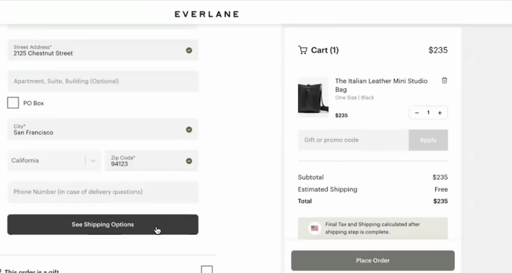
At checkout, users are confronted with a long list of form fields without clear guidance on what is truly required. This immediately feels time-consuming and mentally exhausting.
Why it’s friction (UX + business impact)
A dense form interrupts momentum. Users hesitate, second-guess entries, or abandon entirely—especially on mobile. This leads to:
- Higher form abandonment rates
- Lower mobile conversion rates
- Wasted paid traffic that never reaches payment
Magento-specific causes
Magento’s default checkout form often includes unnecessary address and customer fields enabled by default. Without customization, labels lack contextual help, and validation errors only appear after submission instead of inline.
Forced account creation before payment
What the user experiences
First-time buyers are asked to create an account before they can complete a purchase—adding friction at the most sensitive moment.
Why it’s friction (UX + business impact)
This creates psychological resistance. Users feel they’re being locked into a relationship they haven’t agreed to yet, leading to:
- Immediate checkout exits
- Increased hesitation on first purchases
- Lower first-time customer acquisition
Magento-specific causes
Many Magento stores keep account creation enabled by default for data collection or CRM reasons. While Magento supports guest checkout, it’s often deprioritized or poorly positioned in the UI.
Poorly designed guest checkout flow
What the user experiences
Guest checkout exists—but it feels hidden, secondary, or less reliable than account checkout.
Why it’s friction (UX + business impact)
When users feel like “guests” are second-class citizens, trust drops. This results in:
- Users backing out to browse competitors
- Reduced checkout completion for new users
- Lower conversion rates from paid campaigns
Magento-specific causes
Magento’s default flow often presents guest checkout as an option rather than the default path. Improving this usually requires UI optimization or tools like TOP Magento 2 extensions to optimize for UX to streamline the experience.
Multi-step checkout confusion
What the user experiences
Checkout is split into multiple steps or accordion sections without clarity on how many remain.
Why it’s friction (UX + business impact)
Uncertainty creates impatience. When users don’t know how close they are to finishing, they:
- Hesitate before continuing
- Exit mid-checkout
- Perceive the process as “too long”
This directly impacts checkout completion rates and revenue per session.
Magento-specific causes
Magento’s default checkout architecture often relies on multi-step logic. Without customization, steps feel fragmented rather than cohesive.
Lack of progress indicators
What the user experiences
There’s no clear visual signal showing progress from shipping → payment → review.
Why it’s friction (UX + business impact)
Without a visible roadmap, users feel lost. This increases:
- Drop-offs during shipping or payment
- Anxiety around “how much more is left”
- Reduced trust in the checkout flow
Magento-specific causes
Progress indicators are minimal by default and require theme-level UX enhancements or extensions to visualize checkout progress effectively.
Slow page speed and validation delays
What the user experiences
Shipping rates take time to calculate. Address validation lags. Pages reload unexpectedly.
Why it’s friction (UX + business impact)
Speed equals trust. Delays signal technical instability, leading to:
- User doubt about payment success
- Reduced mobile revenue
- Higher abandonment under poor network conditions
Magento-specific causes
Magento is resource-heavy by nature. Unoptimized servers, excessive extensions, and synchronous validation requests slow down checkout performance.
Mobile-specific usability issues
What the user experiences
Buttons are too small, forms require excessive scrolling, and keyboards cover critical fields.
Why it’s friction (UX + business impact)
Mobile shoppers are especially impatient. Poor mobile UX results in:
- Significantly lower mobile conversion rates
- High bounce rates from paid mobile ads
- Missed revenue from on-the-go shoppers
Magento-specific causes
Many Magento themes prioritize desktop layouts. Without mobile-first design or UX-focused extensions, checkout becomes thumb-unfriendly.
Payment and shipping method overload
What the user experiences
Too many payment and shipping options are shown at once, without prioritization.
Why it’s friction (UX + business impact)
Choice overload causes hesitation. Users pause to compare, doubt their decision, or abandon, resulting in:
- Longer decision times
- Lower checkout completion
- Reduced trust in the buying process
Magento-specific causes
Magento displays all enabled methods by default. Optimizing presentation often requires better UX logic or solutions from TOP Magento 2 extensions for seamless UX to prioritize popular options and hide secondary ones.
How to identify checkout UX friction in your Magento store
Before you start installing extensions or changing code, you need to use data to locate the specific leaks in your checkout funnel.
Behavioral signals: drop-off points, rage clicks, and repeated errors
You can learn a lot by watching how people actually use your site. Behavioral signals are the “body language” of digital users that reveal hidden frustrations:
- Drop-off points: Look at your funnel visualization. If 80% of people move from the cart to shipping but only 20% reach payment, you know exactly where the friction is.
- Rage clicks: This happens when a user clicks a button repeatedly because it isn’t responding. In Magento, this often happens on the “Place Order” button if backend processing is slow.
- Repeated errors: If analytics show users triggering a zip code error multiple times, your validation logic is likely too strict or poorly explained to the customer.
Analytics and reports to monitor checkout performance
Google Analytics 4 (GA4) provides robust tools for tracking the e-commerce journey. By setting up custom events for each step of the Magento checkout, you can see the precise moment users quit.
Pay close attention to the “Time on Document” for the checkout page. If users spend five minutes on a page that should take two, they are likely struggling with form fields or reading fine print. It is also important to consider the relationship between Magento UX and SEO.
While SEO brings people to the door, a high bounce rate at the checkout can signal to search engines that your site isn’t providing a high-quality experience. High-performing sites balance the technical requirements of search bots with the intuitive needs of human shoppers.
UX testing methods specific to Magento checkout flows
To get a truly accurate picture, you should perform regular testing across different scenarios:
- User testing sessions: Hire people to record themselves attempting to buy a product. Listening to their verbal feedback as they navigate the Magento checkout will often reveal surprising points of confusion.
- A/B testing implementation: Try two different versions of your checkout. Does a one-page checkout perform better than the default process? Data will give you the definitive answer for your specific audience.
- Device and browser testing: Test on older Android models and various tablets, not just the latest iPhone. Magento’s CSS can behave differently across browsers, and friction often lurks in unoptimized mobile views.
Conclusion
Reducing checkout UX friction in Magento is not a one-time task but a continuous process of refinement. By moving away from a one-size-fits-all mentality and focusing on the actual needs of your shoppers, you can create a fast, intuitive, and trustworthy environment.
Start by auditing your form fields, enabling guest checkout, and monitoring your site’s speed. When you remove the barriers that stand between a customer and their purchase, you aren’t just improving a website; you are building a better business that respects the user’s time and rewards their interest with a seamless experience.